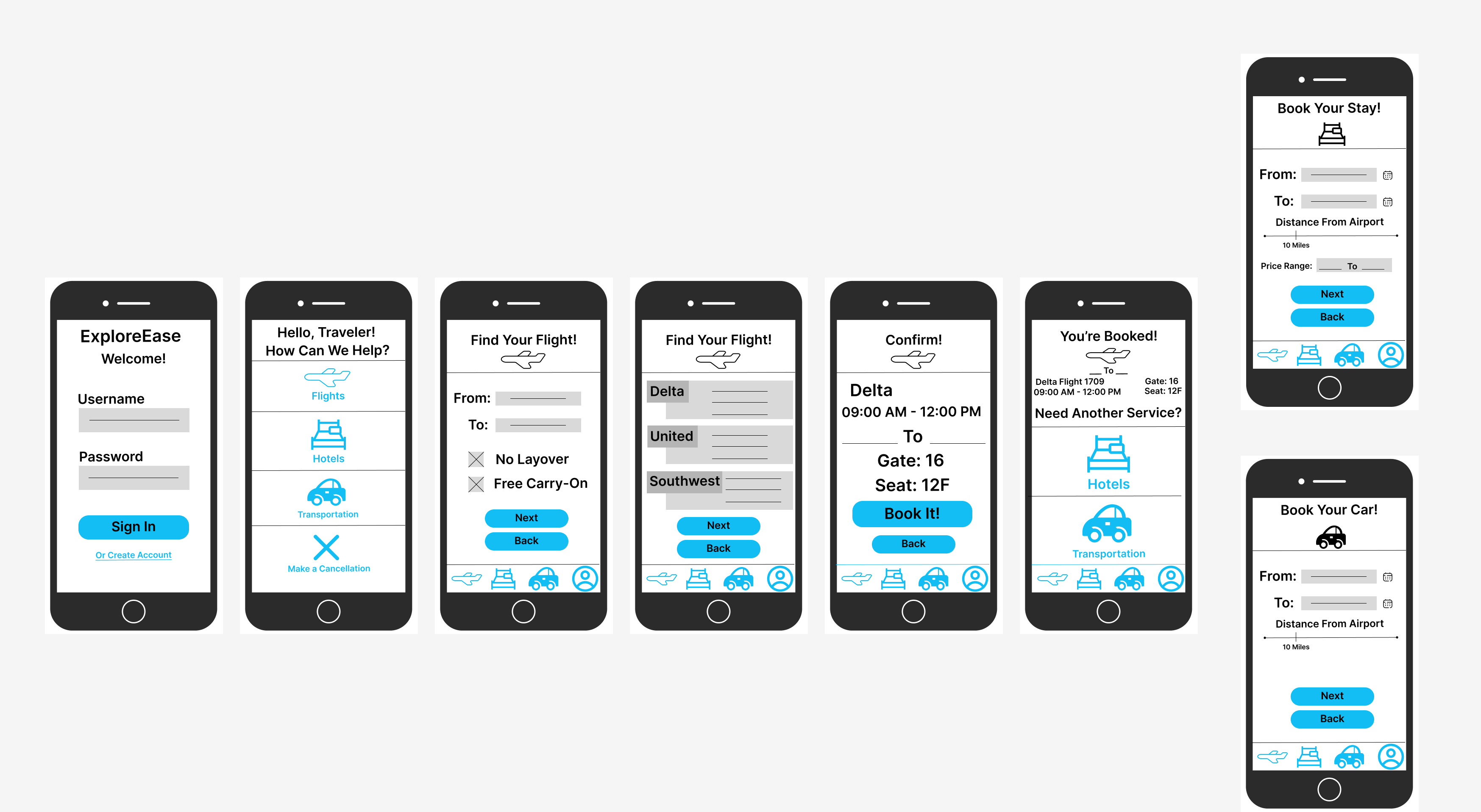
Travel App
Finding a fight currently is highly stressful and every site has different prices. Me and my team were tasked with creating a product that improved upon something that already had a purpose. We ultimately decided that we wanted to think of ways to improve the way we travel and make it more accessible to the average traveler who doesn't know much about booking flights, renting cars, or finding a hotel. Travel does not need to be a headache or a hassle, so we are moving to improve it.
Users
- Users who want a more convenient way to travel
Tools I used
- User personas
- comparative analysis
- landscape analysis
- Wireframing
Problem
We wanted to see if we could streamline this information to create a new app that was more helpful and less stressful to those looking to travel. Our goal is to make an app where all the users' needs for travel are in one place, in order to make traveling more fun and less of a hassle. Making the flight process easier while also filtering in affordable prices for hotels and car rentals in the area that are easily accessible. We want to create a seamless vacation planning app that keeps the user in control of their flight times and the places they stay at.
Research/Solutions
We wanted to enhance the travel planning experience for users, to do this, we initiated a comprehensive analysis to understand what users needed when it came to creating travel plans with ease.
Step One
Analyzing User Needs and Preferences
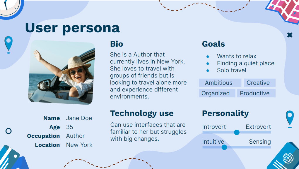
We wanted to focus on a User-centric design, to do this we started creating user personas and conducting surveys. In doing this we hoped to connect with average users and address what they needed in order to plan their future vacations. We gained a lot of insight into users interactions with other travel apps and the users preferences while navigating through the process.
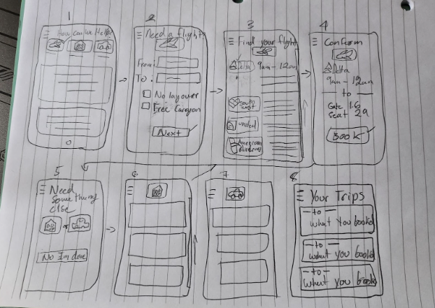
Step Four
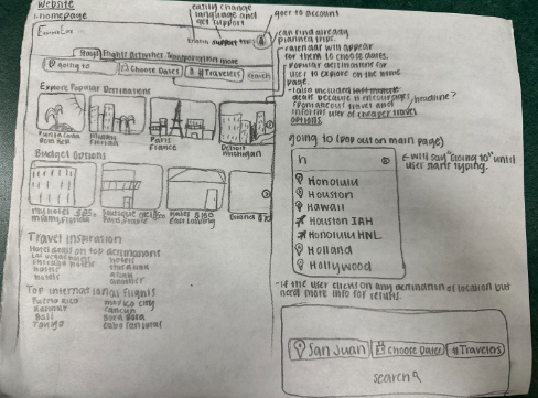
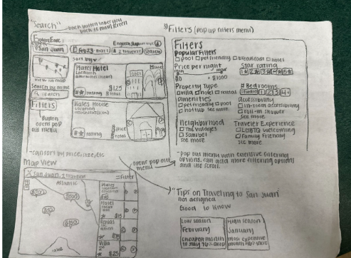
Working as a team we talked extensively about the lo-fi wireframe with the feedback in mind. We allowed each team member a chance to talk from their perspective on the travel app and on what they thought was needed for the app. With this diverse range of perspectives we were able to complete the wireframe for the app as well as the website.
Step Five
Once we had the wireframe done we then had to pitch the travel app to the class. I designed the slide deck that allowed the audience a hint at what the pitch was about. I created a long slide deck with everything on it as well as one that is shorter for a project pitch. My team and I worked together to add the information in a cohesive way.
Full slide deck
Key Features and Design Considerations
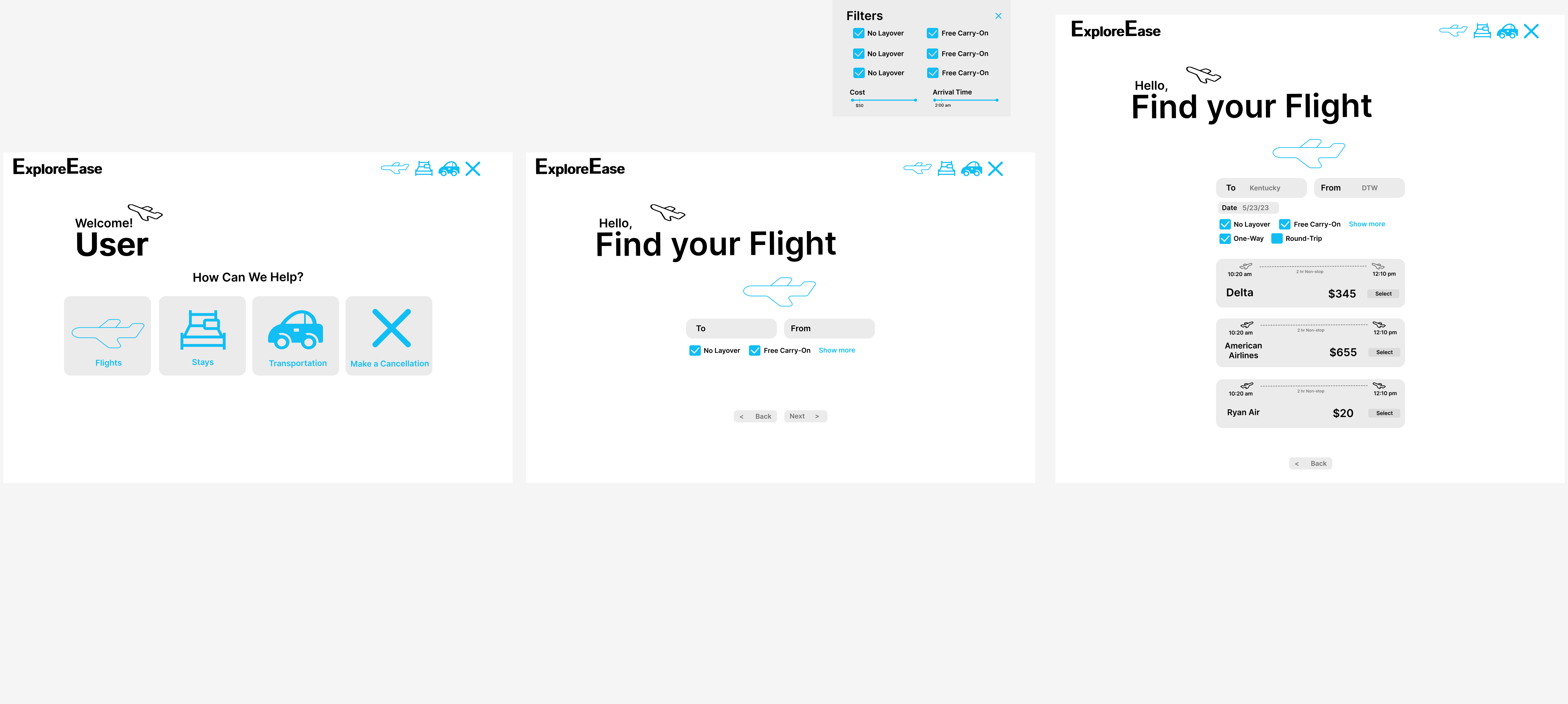
Wide Range of Filtering Options and Personalized Settings:
Allowing users to fully customize their travel planning experience with their future trip in mind.
Tools for Enhanced User Assistance:
Allow tools for price alerts, featured tips, bag measurement, and a flight tracker to limit the apps needed for the users and enhance the user experience.
Improved Cancellation and Payment Processes:
Simplification and optimization of cancellation and payment processes to mitigate friction points and enhance user convenience.
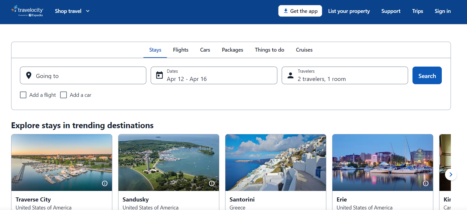
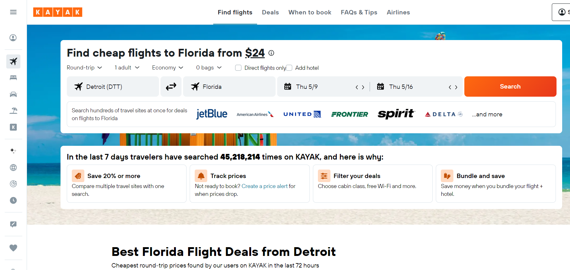
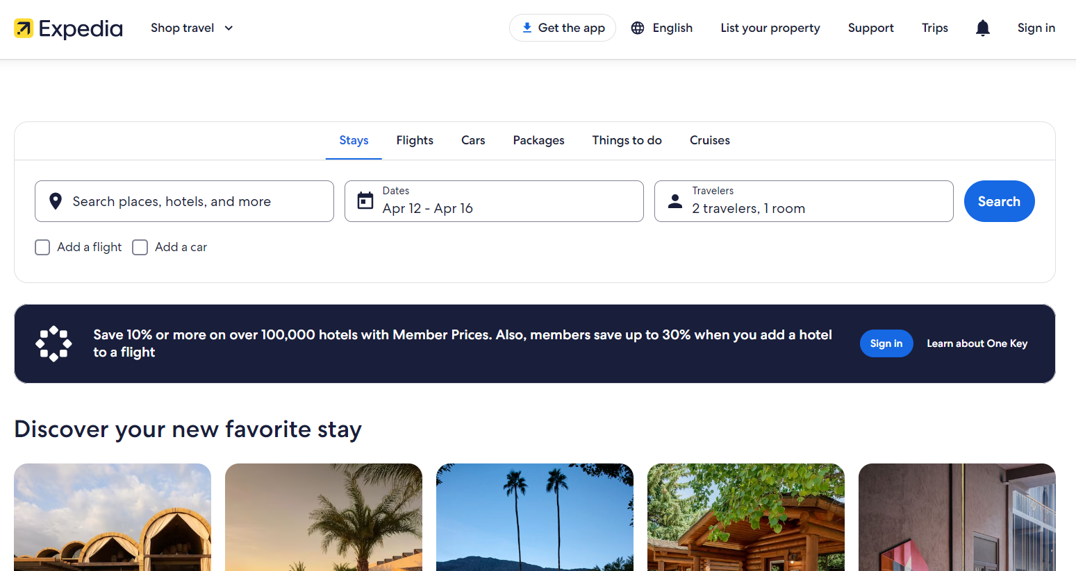
Seamless Integration of Travel Components:
Consolidation of flights, hotels, and car rentals into a unified platform, offering users seamless access to their travel itinerary.
Rationale behind Design Choices
Addressing User Pain Points:
We wanted to streamline the flight research process and consolidate travel-related information into a single, cohesive platform.
Enhancing User Experience:
By prioritizing ease of access and user friendly navigation, we aimed to empower users with tools and features that informed decision-making throughout the travel planning journey as well as after.
Seamless Integration:
Recognizing the importance of seamlessness in user interactions, we integrated previously purchased flights and accommodation details into the platform, allowing users to go back and see if they wanted to stay in the same place for a later trip.
What I learned
One of the most impactful things I learned has been learning to navigate the dynamics of teamwork. I had the opportunity to assume a leadership role for this project, this experience not only broadened my perspective on effective project management but also prompted significant personal growth. I had not previously considered the possibility of taking on such a role, making this a particularly enlightening experience.
The landscape analysis was an enlightening exercise that provided me with a new understanding of my own research capabilities. This project allowed me to view digital content from a user-centric perspective, contributing significantly to my understanding of effective website organization. Which added to my overall focus on user experience as a whole.
Collaborative discussions with fellow group members allowed us to efficiently divide the workload, turning a potentially stressful situation into a more manageable one. Allowing me to put in perspective that communication in collaboration is an important part of any project. Personally, I found creating wireframes, including sketches and low-fi representations, to be a particularly enjoyable aspect of the project. Witnessing ideas come to life, even in their early stages, provided a tangible sense of accomplishment for me. I believe I have developed a comprehensive understanding of the processes behind creating an app and website.
The challenges encountered throughout this project have contributed significantly to my professional and personal growth. While I will refrain from claiming perfection, I acknowledge that the journey of learning is an ongoing process. As this project concludes, I am grateful for the valuable lessons learned and the growth experienced. I may also recognize that this project could have been improved on, as all projects are never 100% perfect, but I can confidently affirm that this project has been a fulfilling journey of learning and development.