Hannah Al​am

Experience architecture:
UX Research and Design

Users:

  • S​tudents 
  • Gues​ts that visited the library on a regular basis

My Role:

  • User researcher
  • Designer

Tools I used:

  • user personas
  • user surveys
  • Comparative analysis
  • Field Study
  • figma 

The Problem

The library signs were outdated and were lacking user engagement due to the signs being unnoticed. The signs themselves relied heavily on the user already knowing somewhat what they were looking for or the users having pieces of information that was hard to get.

Research/solutions

Step One

User personas and Surveys

In order to properly start to address the concerns with the signs, we first needed to talk to the users. I wanted to ask questions like who our average users are and what their needs are. To do this I came up with some user persona profiles based on who I thought to be the average users of the digital screens. I then created a survey for users who go to the library on a regular basis to get a sense of how they interact with the signs and how they usually spend their time when they are at the library.

Heuristic Analysis

Ex. User Persona

Step Two

Comparative analysis

I then released the survey and started to collect data with the users at the front of my mind. While I was collecting this data, my team decided to see if there were any other digital signs around the Michigan State campus that we can interact with and do a comparative analysis. Once we found that there were indeed digital signs, I went and did a thorough analysis of these signs to compare them to the library signs. Once my team and I were done I created a comparative analysis report and met with my team to discuss. Then we crafted a scenario together that can be tested with the current digital screens to see what the users thought could be improved.

Digital sign at the Business college

Digital sign at the Scholarship Lab

Digital sign at the Scholarship Lab

Step Three

Field Study

Me and my team spent the day at the library asking for volunteers to participate in our user testing. We guided them through trying to find a book using the screens as well as trying to find a curtain room within the library. What we found was that it was the first time for many of the users to interact with the signs and they also did not know the signs were interactive at all. After the testing, I created a user testing report on what we found and discussed what could potentially be improved as we moved on to the designing phase.

MSU Library

Mockups for MSU Library​ Signs 

Mockups for MSU Library​ Signs 

Step Four

Designing

We collectively decided that we would all participate in the design phase so that we could get a diverse set of opinions on the overall design of the screens. One of the most prevalent things that was discovered during the user testing was the fact that not many users knew the signs were interactive. To rectify this we decided to implement a screen saver type of screen that flashes touch to start. This helps users notice the signs more when they are just passing by them. Another thing that we decided to do was to change the branding of the sign, as the colors did not match the MSU branding and looked semi out of place within the library. We also created mock ups of the physical signs to allow for better accessibility for those in wheelchairs to easily access them.

Mockups for MSU Library​ Signs 

What I learned

Throughout this project, I have deepened my comprehension of user research, recognizing its significance in establishing a meaningful connection with users. This heightened understanding has translated into enhanced communication skills and a more adept execution of field studies and user testing. Specifically, I've become more open in my approach to the users, facilitating the extraction of valuable information for product improvement.

Moreover, this project has allowed me to reassess and expand my limits, fostering a more open expression of my thoughts.While I don't consider shyness a flaw, these experiences have provided a platform for self-reflection and personal growth. Concurrently, my proficiency in conducting heuristic analysis has progressed significantly, enabling a more detailed examination and identification of accessibility issues.

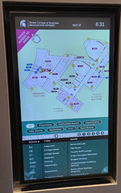
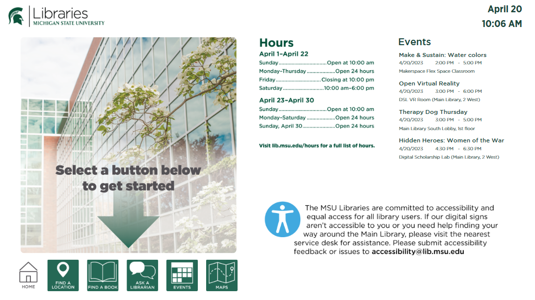
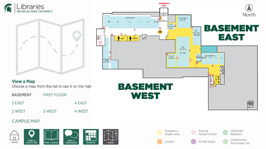
During this project, I improved in using Figma, particularly while creating the map for library signs. Despite the initial struggles, it motivated me to enhance my proficiency in this tool and complete the design work I was tasked with.

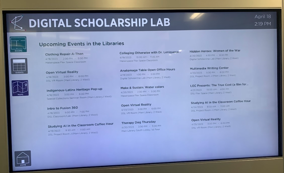
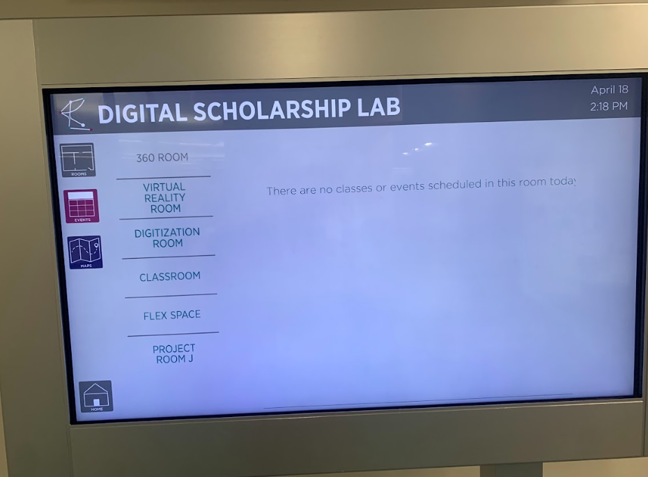
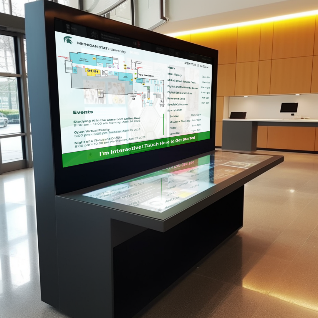
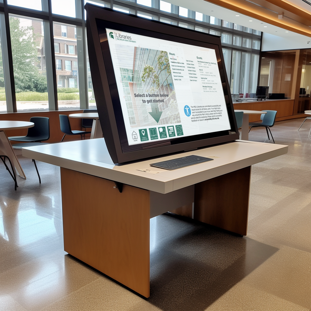
The comparative analysis proved to be an interesting exercise, allowing me to find effective elements from various digital screens into the redesign of the library's digital screens. Notably, the heuristic and competitive analyses were strengths for me, as they align with my ability to scrutinize details and identify areas for improvement.

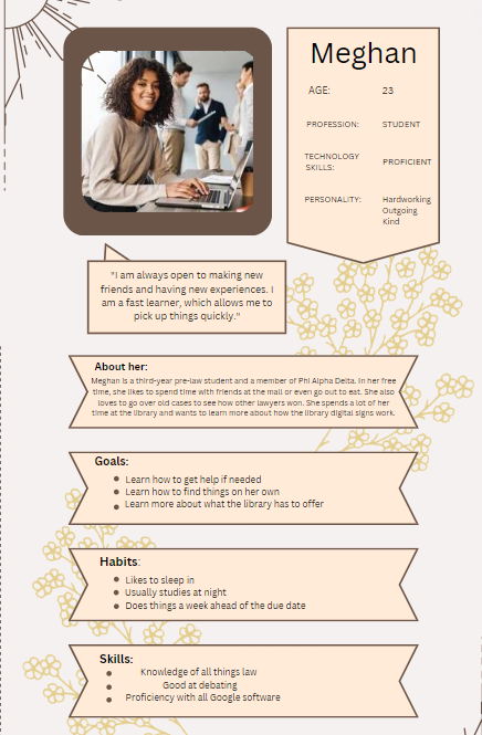
The creation of diverse personas for potential library screen users was a particularly enjoyable aspect of this project. This exercise not only allowed for creativity but also contributed to a better understanding of user interactions with digital screens.

I've honed my skills in interview setup, maintaining a professional yet comfortable demeanor when engaging with users. Additionally, my experience in conducting field studies has improved, enabling the design of effective user testing methods for gathering important information and implementing real improvements. Working within a group on this project has also provided valuable insights into effective communication, ensuring everyone feels included and acknowledged.